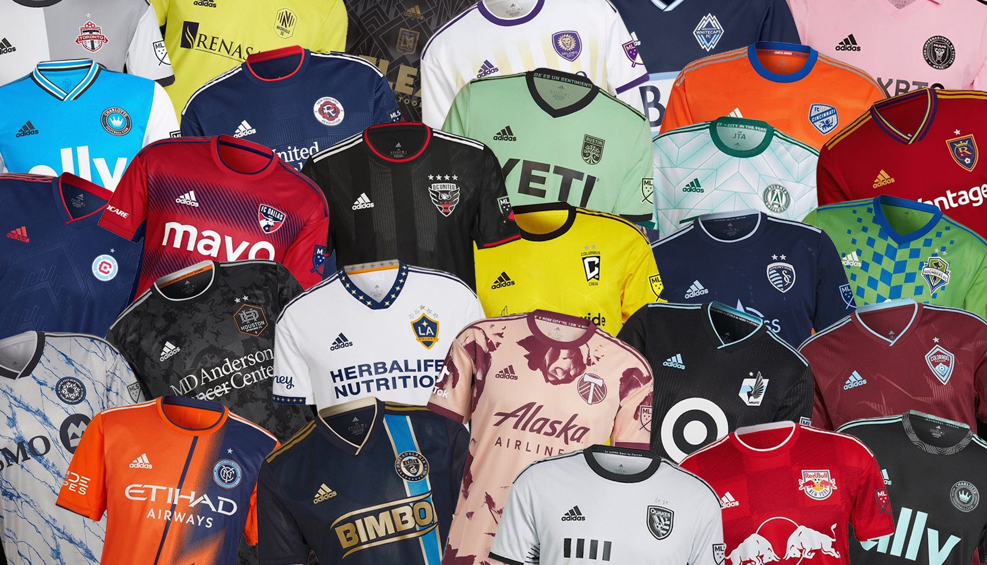
Ranking the 2024 MLS Jerseys
Mar 28, 2024

Who has the best kit of the 2024 season?
Today I'm going to rate the 29 MLS teams uniform kits (jerseys) in order from worst to first. These are just my opinion and are mainly decided solely on a visual factor. I'm not taking into consideration hidden design elements for local culture, team history etc. I am just ranking these as if I were a person inside the MLS store and had 0 information on anything soccer related and were solely looking for the 'coolest looking' jersey.
San Jose

Very boring, no fun accents either. I wish they did more of an incorporation of their 90's style logo on the pocket. Either go for all 90's theme or don't.
Orlando

Pretty much the same as the jersey above, only with some incorporated grey accents that help it stand out a tad.
Toronto

Once again a very minimal white and red look. This one places higher up due to the faded pattern on the jersey but not by much.
Vancouver

Our first non white & red jersey of the rankings. I enjoy the colors they picked for the navy and gold but overall it is missing a ton of 'design' seems like a high school jersey.
Los Angeles (Galaxy)

A nice switch up compared to the white jerseys so far.
Montreal

I like the shades of blue they used but it still feels rather boring and lazy for an official jersey.
Colorado

Overall these are really unique. And they probably look the least like a 'typical' MLS kit.
Nashville

A very bold yellow paired with a large centered bar across the chest definitely help it stand out.
Houston

The deep royal blue used on this is very nice but the overall design is lacking.
Los Angeles (LAFC)

A fun play on what seems to look like more of a 2000's era jersey.
St. Louis

I love the pattern in the background paired with this almost highlighter pinkish red.
Columbus

A unique center shape for the logo highlight, but it looks like Charlie Brown!
Miami

I love the pink as its very unique. I wish they did more than just a center stack logo.
Dallas

Awesome gradient effect, was hoping for more work with the striping though.
Philadelphia

Top 15! This is a better center stacked jersey than Miami and features a sweet pattern.
Chicago

Probably the best of the simple jerseys with a big block on it. I love the incorporation of the baby blue in there too.
New England

Very European looking and sophisticated. I like that the stripes aren't full stripes but rather different sized dots.
Salt Lake City

A great kit but the color swatches are almost identical to the infamous FC Barcelona jersey. But I still ranked it higher up because it is something different.
Kansas City

Great use of colors and sticking to a tone while having different highlights.
Portland

We're in the top 10! Love how unique this is and I love the tan, I just wish it weren't so symmetrical.
Atlanta

Very different! Reminds me of a golden state warriors jersey.
Cincinnati

Although it is plain, I think this is the proper way to do something plain, by adding in a fun pattern somewhere like the cuffs that ties everything together.
Washington D.C.

A great pattern and a great use of grey + red so it isn't overhwelming.
Charlotte

A great homage to the nearby mountains, while also being something that is super unique on a jersey. Love the colors too.
Minnesota

Very unique and something kids would love. I'm not sure what it has to do with Minnesota but it looks cool!
New York (NYCFC)

I love this split color technique and how subtle it is. No one else did anything like this and it really looks sophisticated!
Austin

A great color combo coupled with an easy to read logo + the curves of green on the sleeves and shoulders just look really natural and form fitting for a person wearing this.
Seattle

Loving the 90s vibes this gives off and I think the green and the blue actually work pretty well together!
New York (NYRB)

#1 to me because it is this most fun, the logo stands out great and also incorporates a shade of red in it as well. It looks intimidating, yet modern and sleek.